Proportional Area Radar Charts are alternate forms of ‘radar’ and ‘slice’ charts which ensure the filled-in area of such plots is proportional to the data represented, regardless of variable ordering.
Radar charts are visually arresting and intuitive. Several categories of data can be displayed at once and the resulting shapes are characteristic, especially when a consistent template is used. However, there are serious and valid criticisms of this type of chart. The charts can be visually misleading, as the enclosed area increases disproportionately away from the centre, and inconsistent, as the area also depends on the ordering of the data. In this first post I want to write about this popular, if controversial, visualisation and my attempt to address its two major shortcomings: the area vs length problem and the ordering problem.
Despite these problems the radar chart remains popular, especially in the world of football analytics which is where I have encountered them most (possibly in part due to a generation of football fans who grew up with of the video game Pro Evolution Soccer, which uses them). Indeed, Ted Knutson, CEO of StatsBomb, (check out the company logo, previously an actual bomb, now a radar) gave an impassioned defence of them, claiming they are the single visualisation that best captures the attention and that at some football clubs, “radars became accepted as a default visualization type” [1]. Radars have value in terms of engagement and, in an area where communication between analysts and practitioners is crucial, will remain popular. Knutson concludes his article: “[…] radars remain a pretty damned good visualisation for displaying most of the different elements in player skill sets, which is the most important conversation topic we have in player recruitment” with the footnote “In my opinion at least, and provided you correct for their flaws and educate your users.”
These charts capture something characteristic and immediately comparable across cases when a default layout is chosen and adhered to. Although the radial layout makes comparison across categories harder than, say, a bar chart, the categories are more clearly demarcated so comparison between individual radar charts is more immediate than between charts with parallel axes. Radars are here to stay so fixing the flaws is no trivial endeavour.
Types of Radar Charts
I want to expand the discussion to include a related chart type. We will examine two chart types which I will term the join-the-dots radar (to differentiate from the proportional area radar to come later), which joins each data point on each axis by a straight line, as shown below left, and the sectoral bar chart, effectively a bar chart wrapped or warped around a centre, as illustrated below right—these are also known as ‘slice charts’ or even ‘pizza charts’.
Here we are using an example dataset with values 11, 95, 98, 29, 47, 56, and 78 all on a scale of 0 to 100.

Both types of radar chart suffer an identical distortion: the values displayed—the length along the spoke—do not correspond with the filled area, and so the viewer may, intuitively, interpret either the lengths or areas as representing the values, although only one, commonly length, in fact does. The question of whether we read and interpret these charts and the values they display based on area, length, or some combination or average of the two would, of course, be moot if these values were (linearly) proportional; this is exactly my proposed fix.
We first discuss the geometry of both charts in a little more detail.
Sectoral Bar Charts
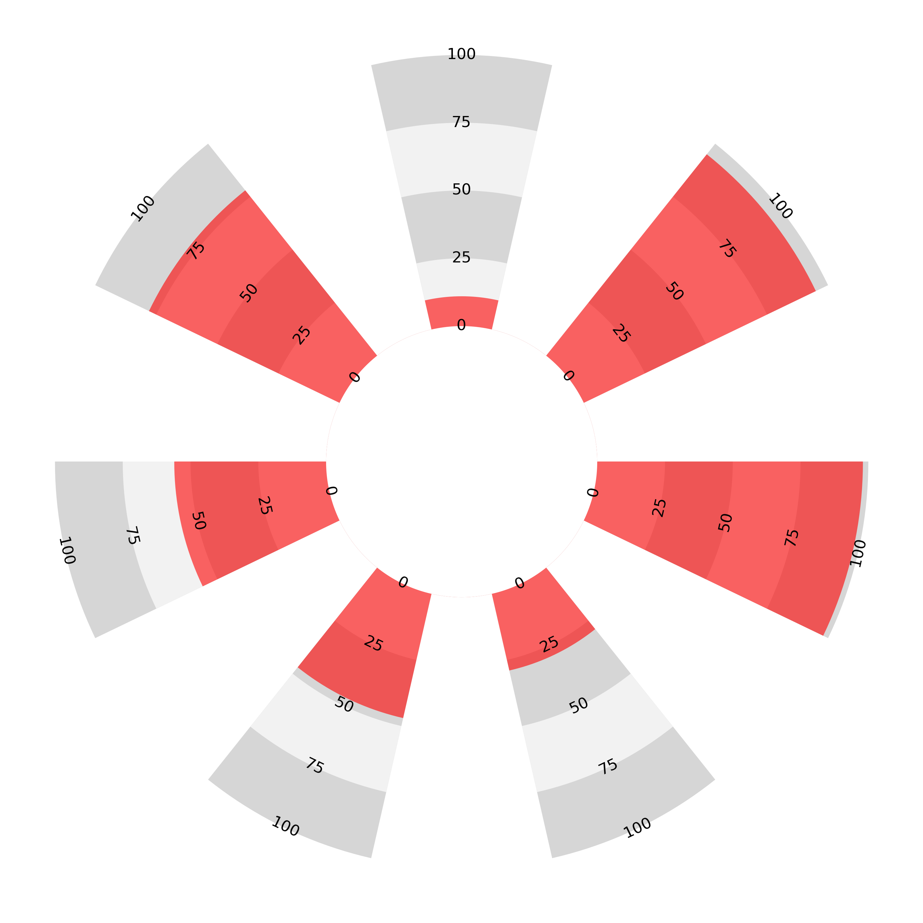
The sectoral bar chart can be constructed in two ways: either the length or area can be chosen to be proportional to the values represented, but not both. Below left, the axes are linear and this means that the areas become exaggerated disproportionately further from the centre. On the right, the axes are no longer linear but quadratic, meaning that the area enclosed is proportional to the given value. The result is that higher values get ‘bunched up’ along the axis near the perimeter.
The two charts below are plotted with the same example data as above.
In the football analytics context, in perhaps the highest profile use of these charts, Tom Worville, during his time at The Athletic, changed his approach from area-proportional sectoral bar charts to length-proportional, having initially chosen the area-proportional style [2]. Seemingly neither were satisfactory.
Because the sectors are wider further from the centre, if we wanted the area to be proportional to the length of the bar we would need the bars to taper as they got further from the centre, completely changing the shape of the plot (an idea we will return to later). However, as it is, proportionality is an exclusive choice between area and length.
Radars
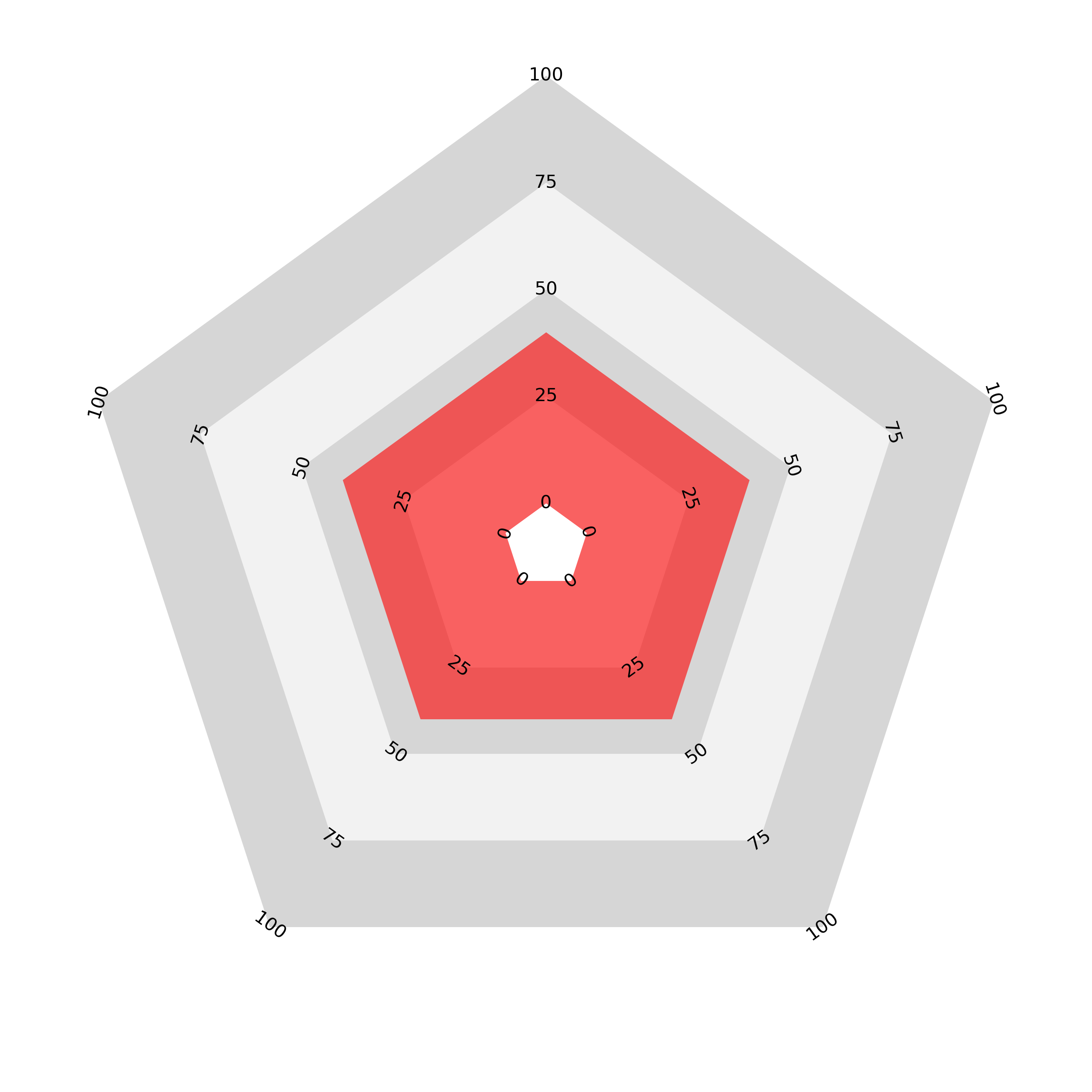
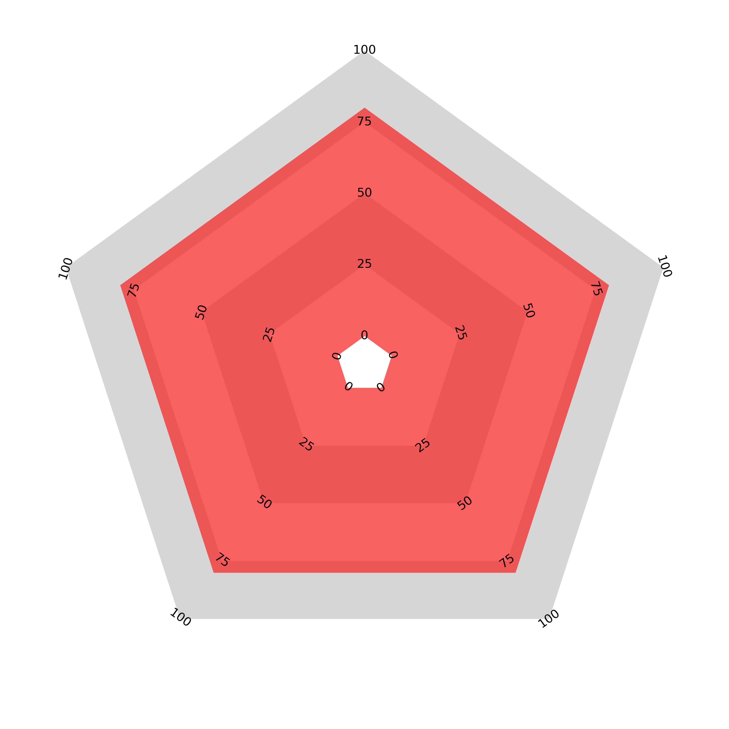
In the ‘join the dots’ radar chart the length vs. area problem is apparent again. Compare the areas enclosed by the two charts below. One has values of 40 for all categories and the other has double that, with a value of 80 for each category but the area enclosed by the second chart is almost 4 times that of the first (if the origin was exactly at the centre it would be exactly 4 times).
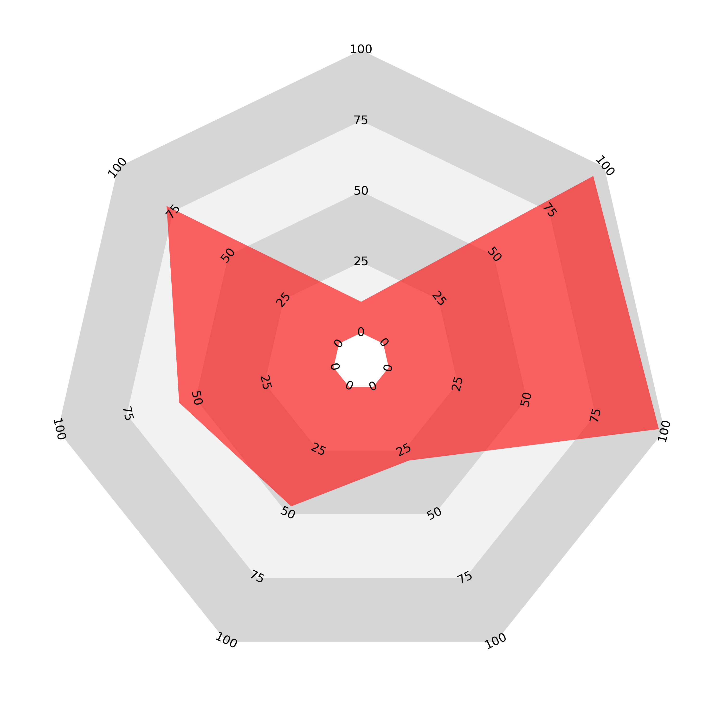
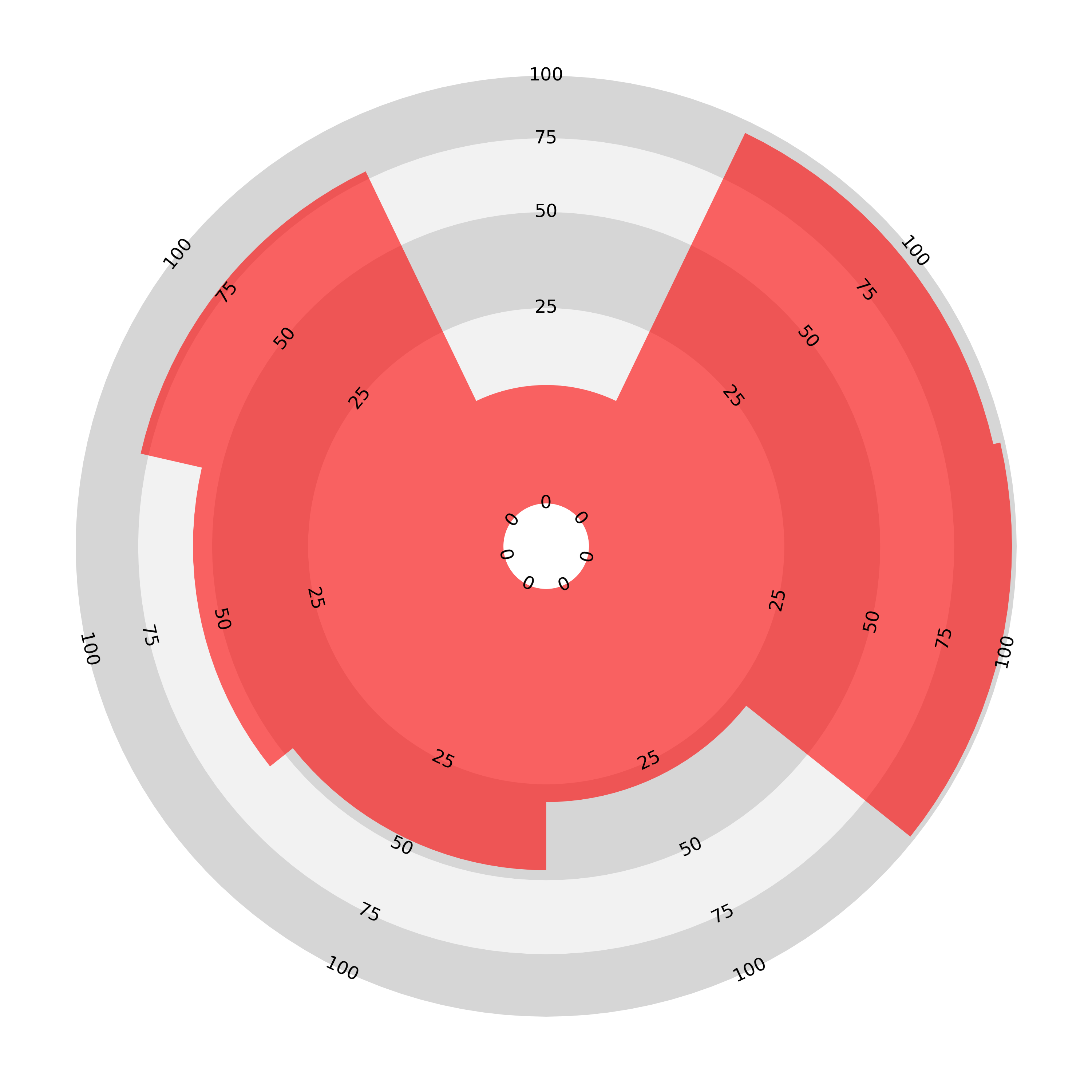
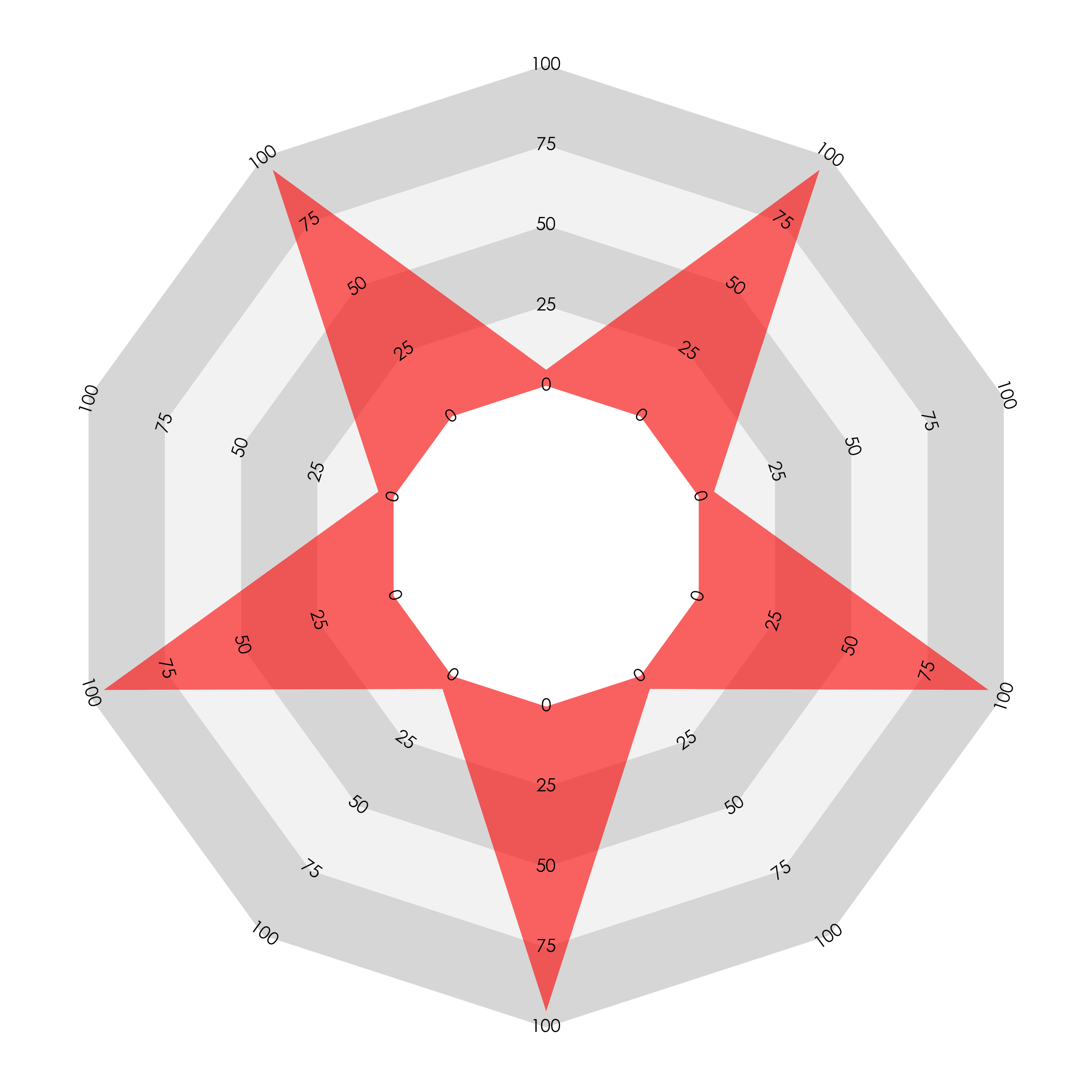
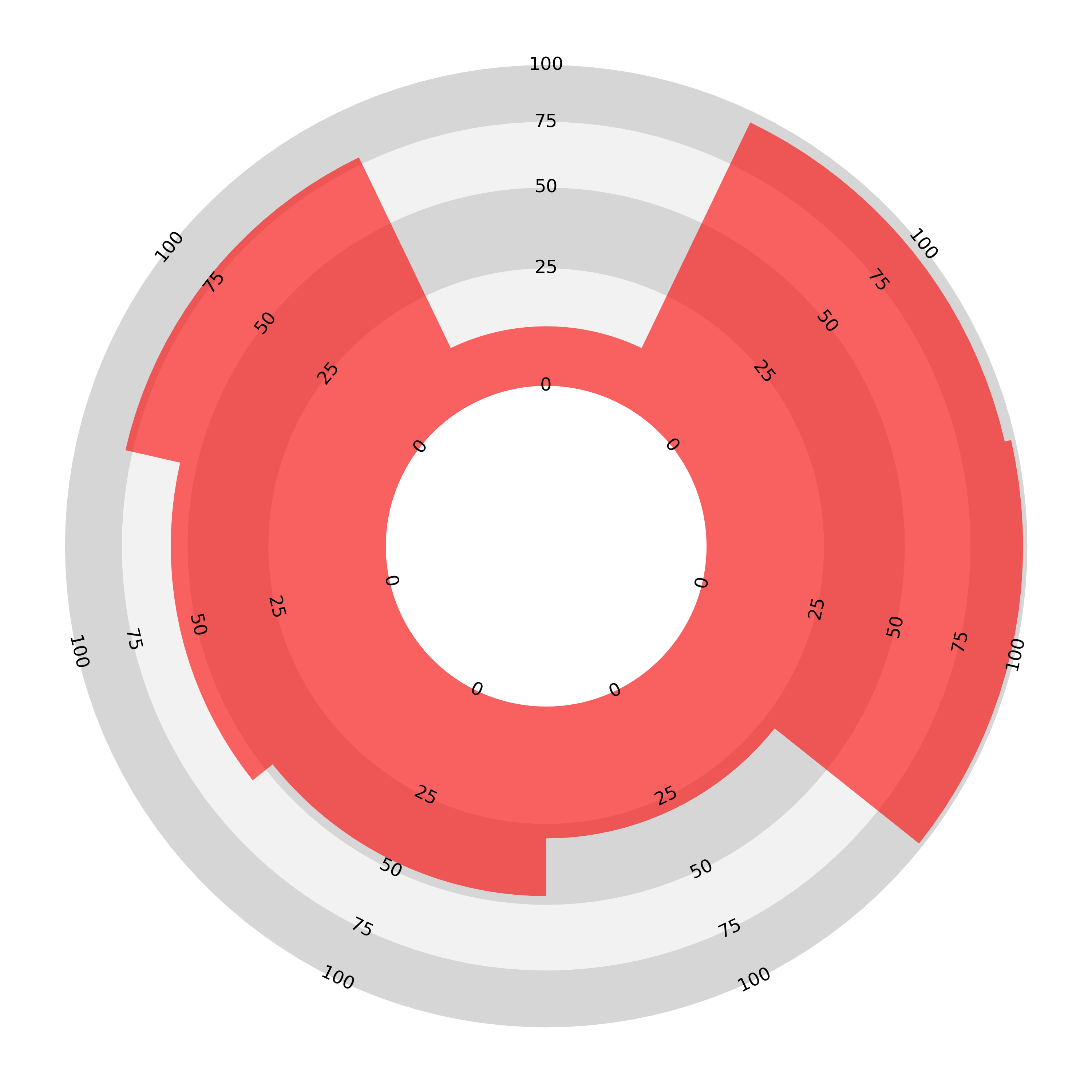
There is a further problem: not only does the length/area disparity exist but the ordering of the variables also affects the enclosed area. Here is an illustration of the problem: we present two ‘join-the-dots’ radar charts displaying the same data: ten values, five of 5 and five of 95 on a scale from 0 to 100. The chart on the left presents these values in an alternating order, while the chart on the right groups like values together.
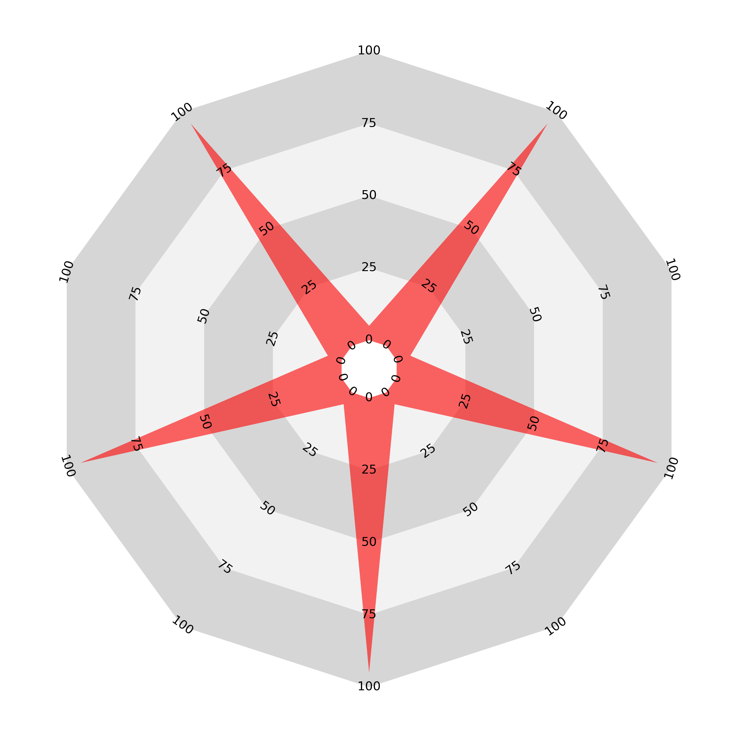
The result is that the area enclosed by the second chart is much greater than the first, despite both charts representing exactly the same data. It seems that the ‘join the dots radar’ is potentially even more misleading than the sectoral bar chart, which is consistently and systematically disproportioned.
Counter Size
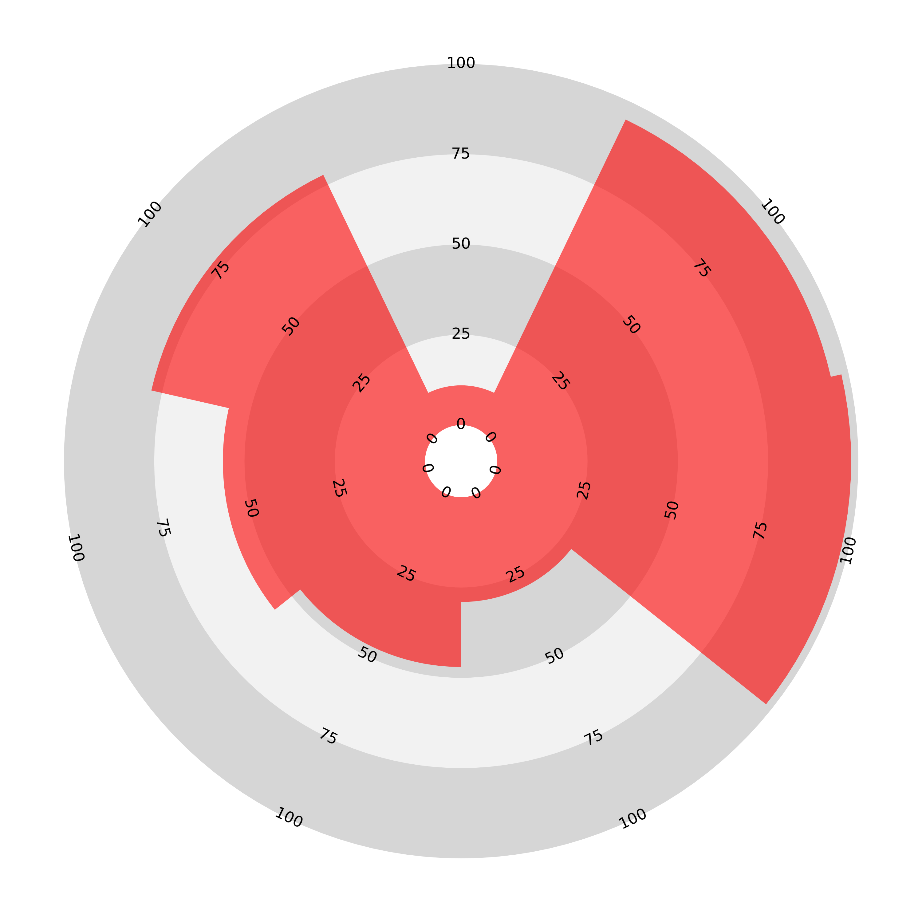
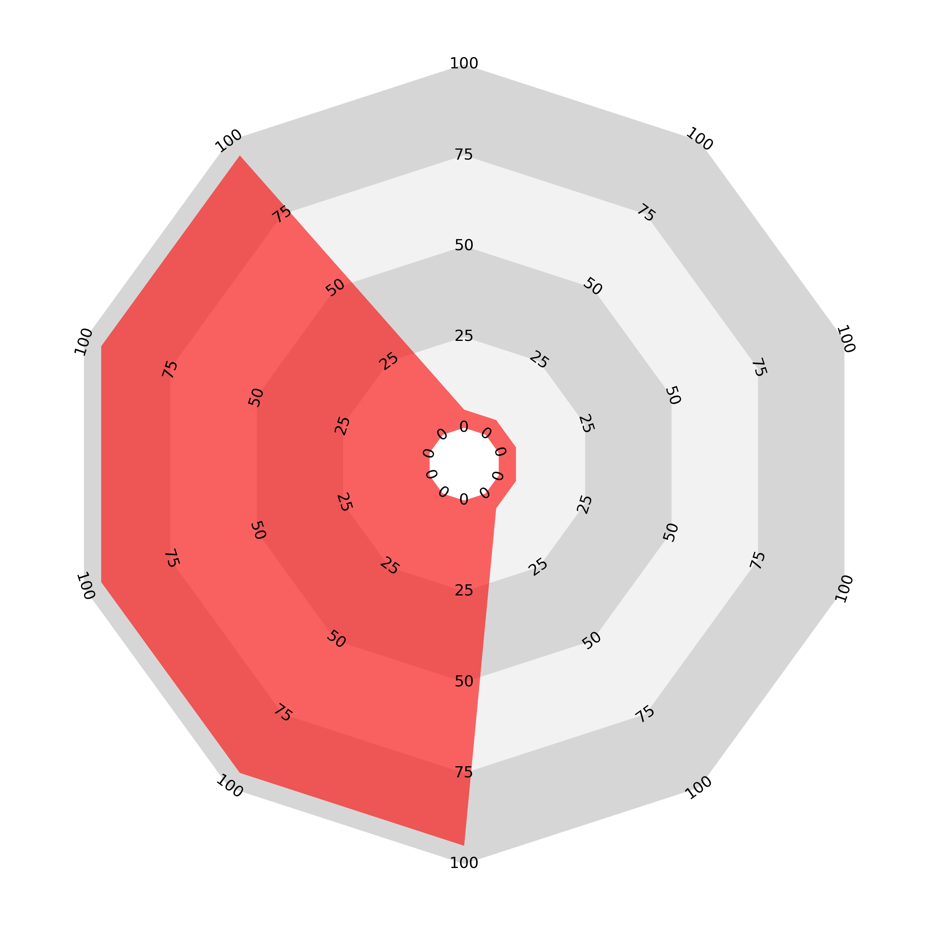
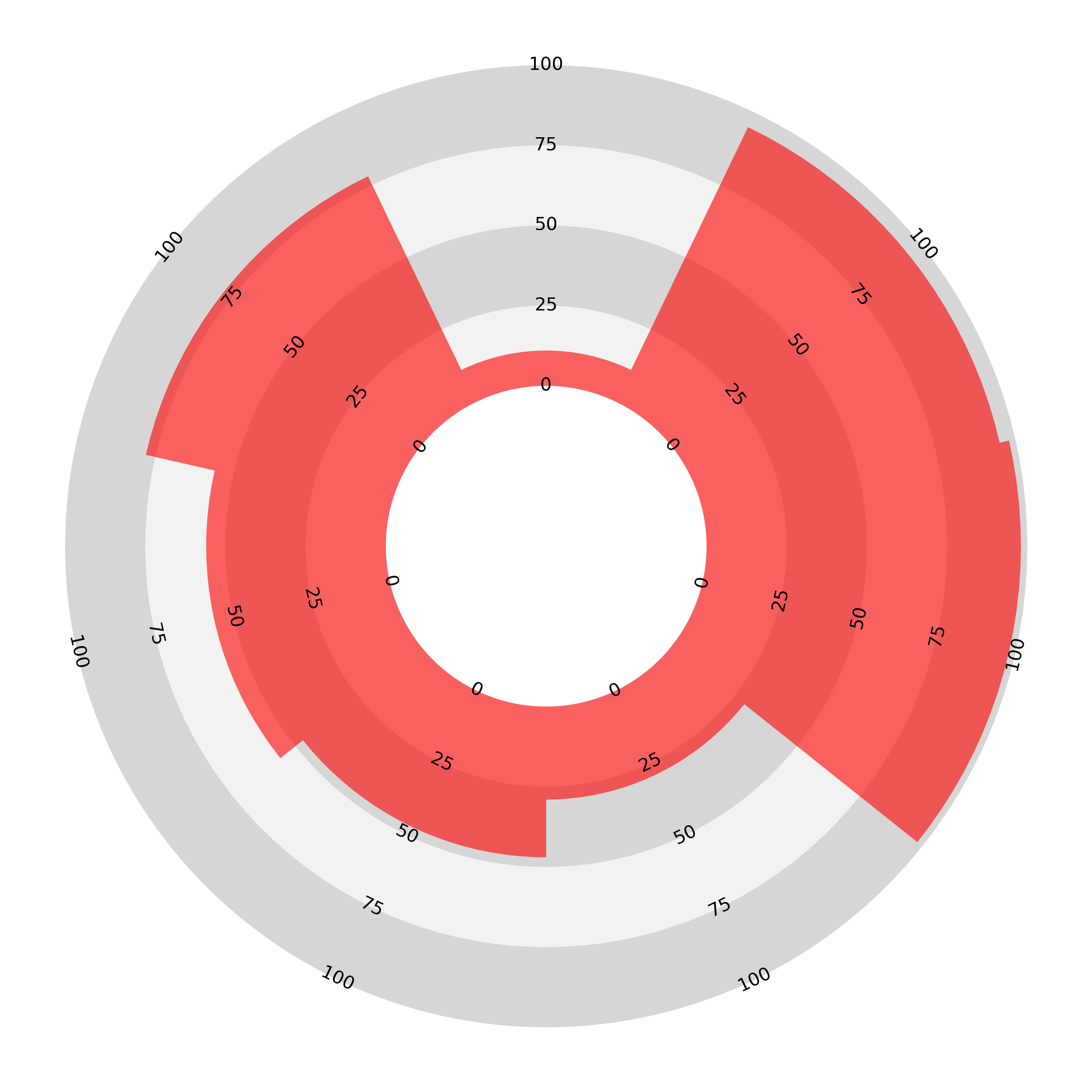
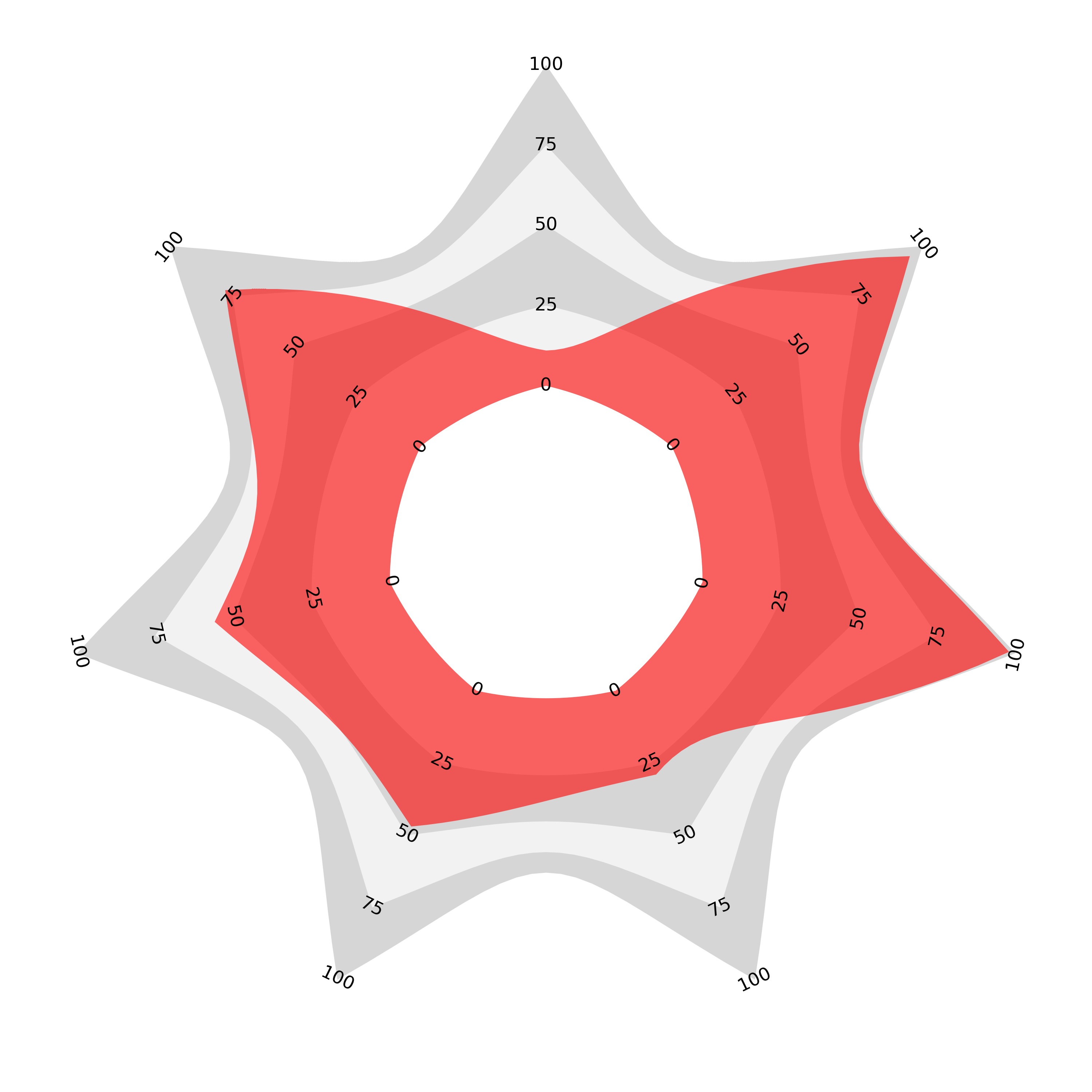
As a first step, we can make this behaviour less severe by enlarging the central counter. Compare the above two charts with these:
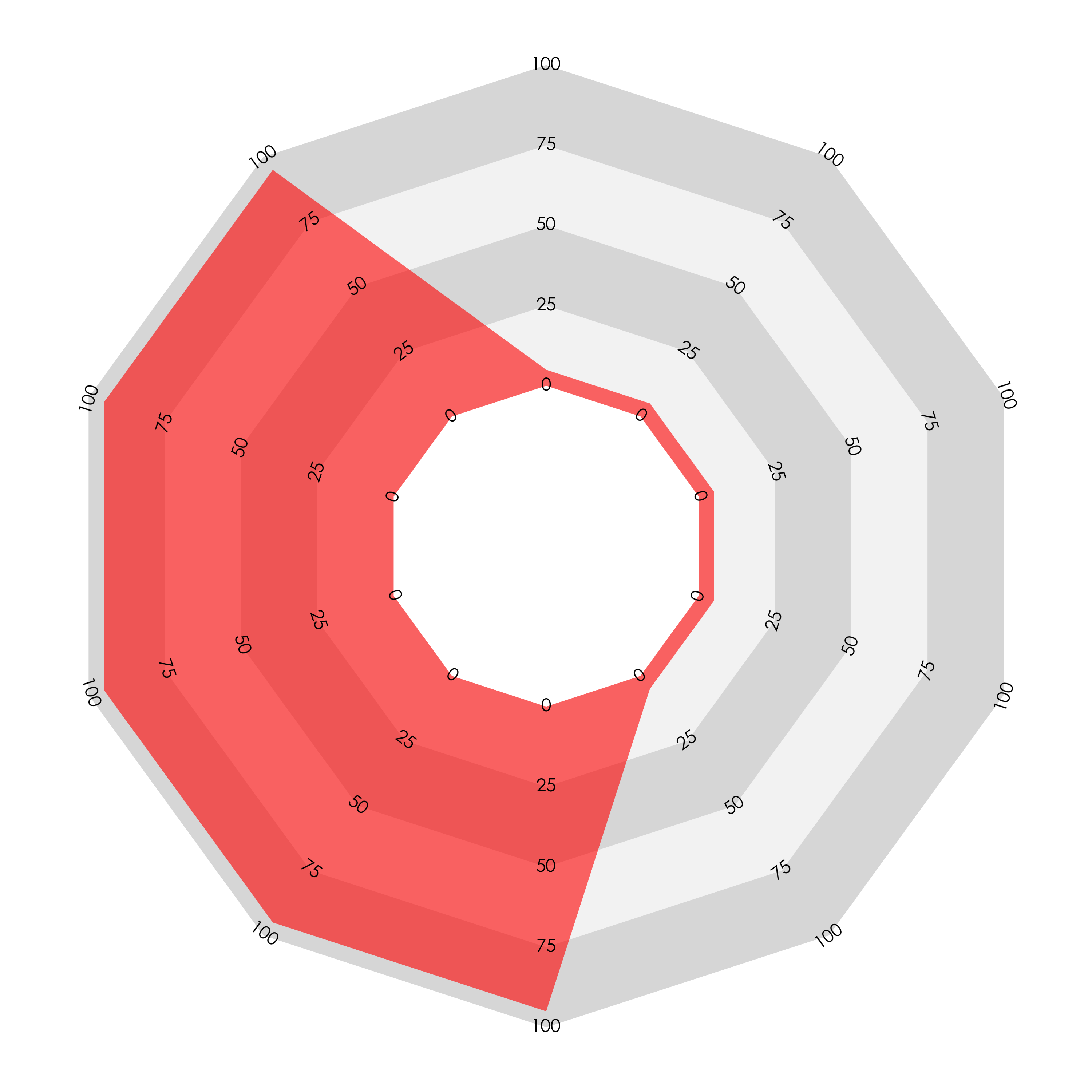
The ‘spiky’ chart on the left with alternating values no longer looks almost empty, but the chart on the right still fills a greater area and looks that way too. This adjustment also softens the effect for both types of sectoral bar chart. Here are three examples with the example data for the join-the-dots, sectoral linear bar, and sectoral areal bar radars:

An enlarged central counter only mitigates the distortion; it does not solved the problem. To fully address area-length proportionality we need another approach.
Proportional Area
The ‘join-the-dots’ radar is the chart for which we can address the problems by making a small adjustment. If, instead of joining the dots with a straight line we join them with a curve, we can choose this curve so that the area enclosed in each sector is proportional to the two adjacent values (to their sum or, equivalently, their average). We just need to solve some equations involving polar integrals (details to follow in a subsequent post).
The result is the proportional area radar. Here we plot the same data as above (the sample data — 0.11, 0.78, 0.56, 0.47, 0.29, 0.98, 0.95), anticlockwise from the top—and the ordering comparison, again five values of 0.1 and five of 0.9 with the same two orderings) using the proportional area radar:
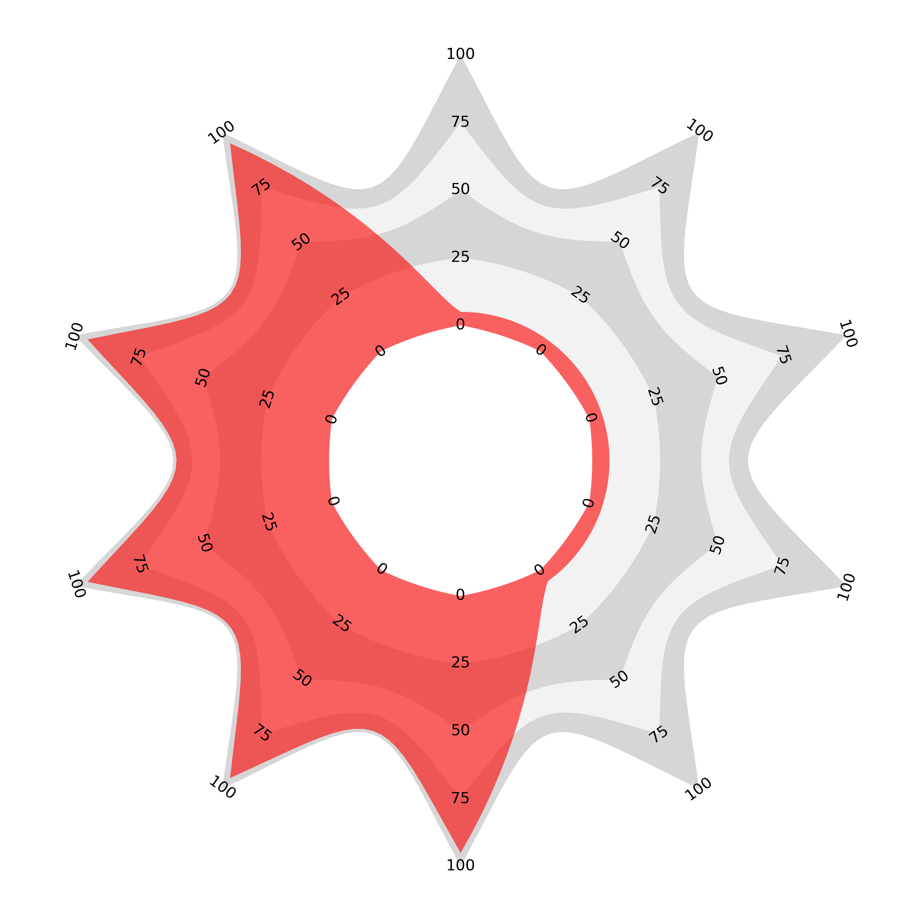
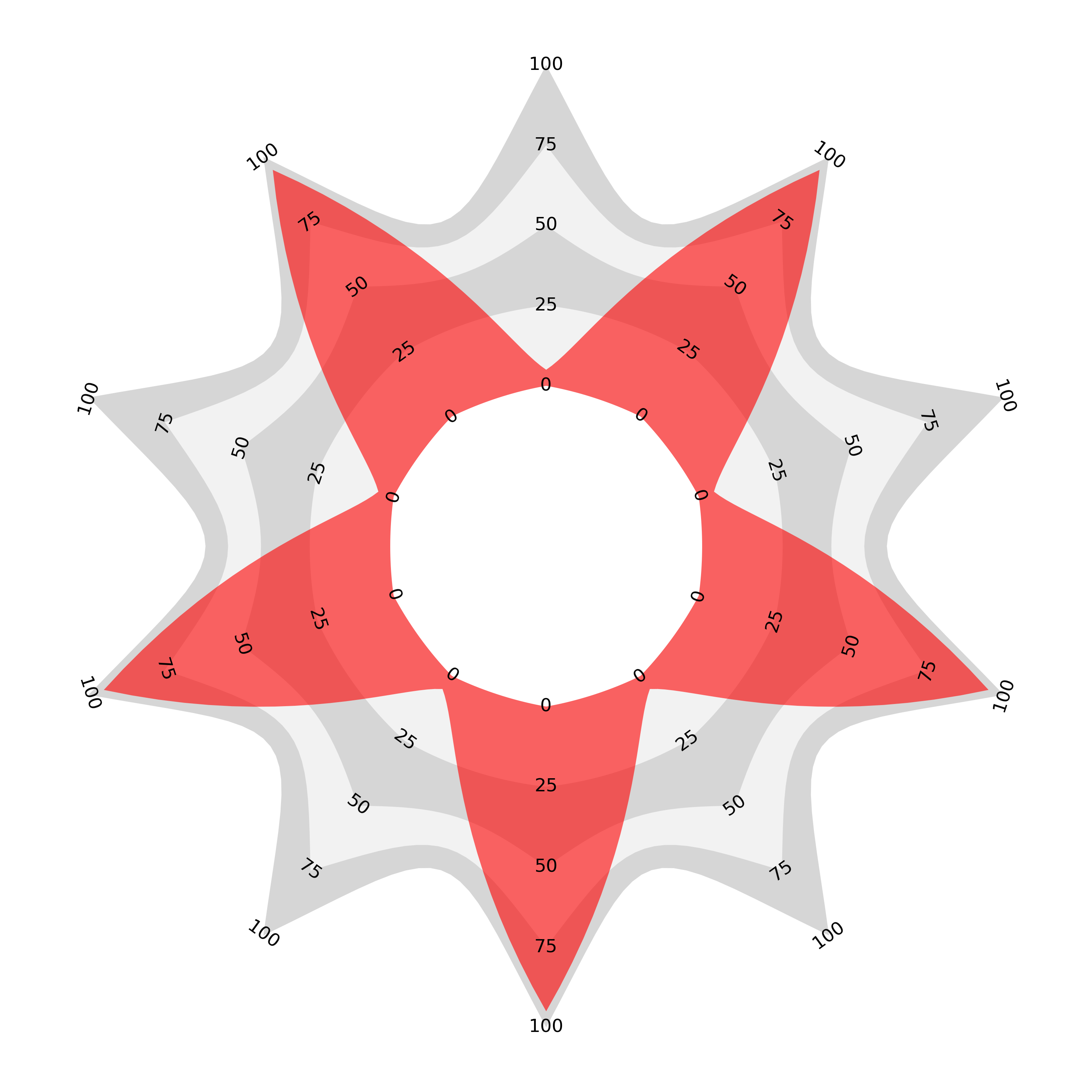
The alternately ordered chart looks very similar to the join the dots version with a slight curve. However, the second ordering with all large values adjacent now encloses the same area as the curve dips between the higher values. I believe that this is not only mathematically true but visually true and so the perception of the whole should now match the sum or average of the components.
Distinctive Shape
You might notice that I have retained the enlarged counter. This isn’t strictly necessary, but it keeps the shapes from becoming too extreme. There is also a choice to be made regarding the constant of proportionality but, with the choice shown here, the central counter is a slightly bulbous polygon, the shape around the 25 mark is almost a circle, and from thereon out the shape turns gradually into an increasingly spiky star. I think that this modest range of shapes gives another visual anchor along with the annotated axes, and with familiarity the shapes should be recognisable themselves without a reference.

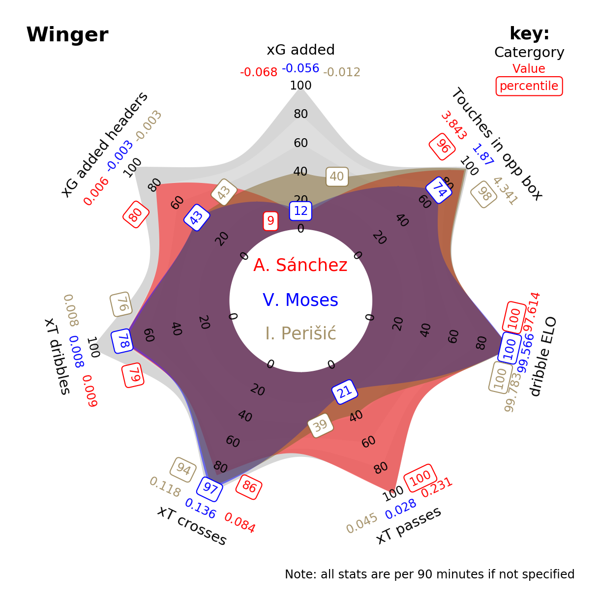
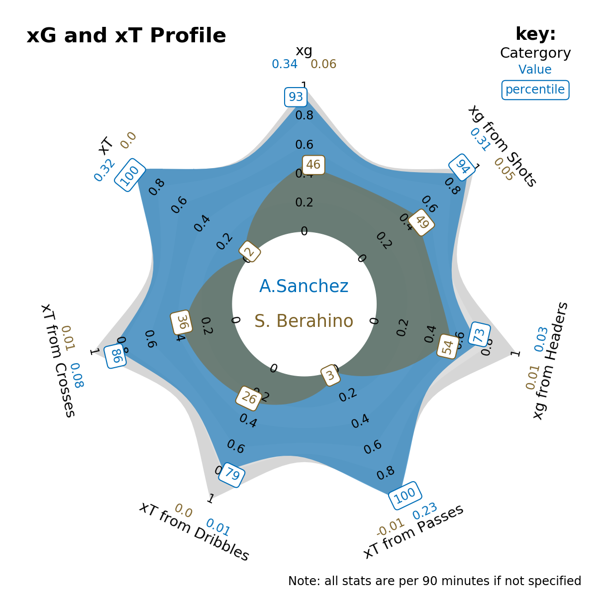
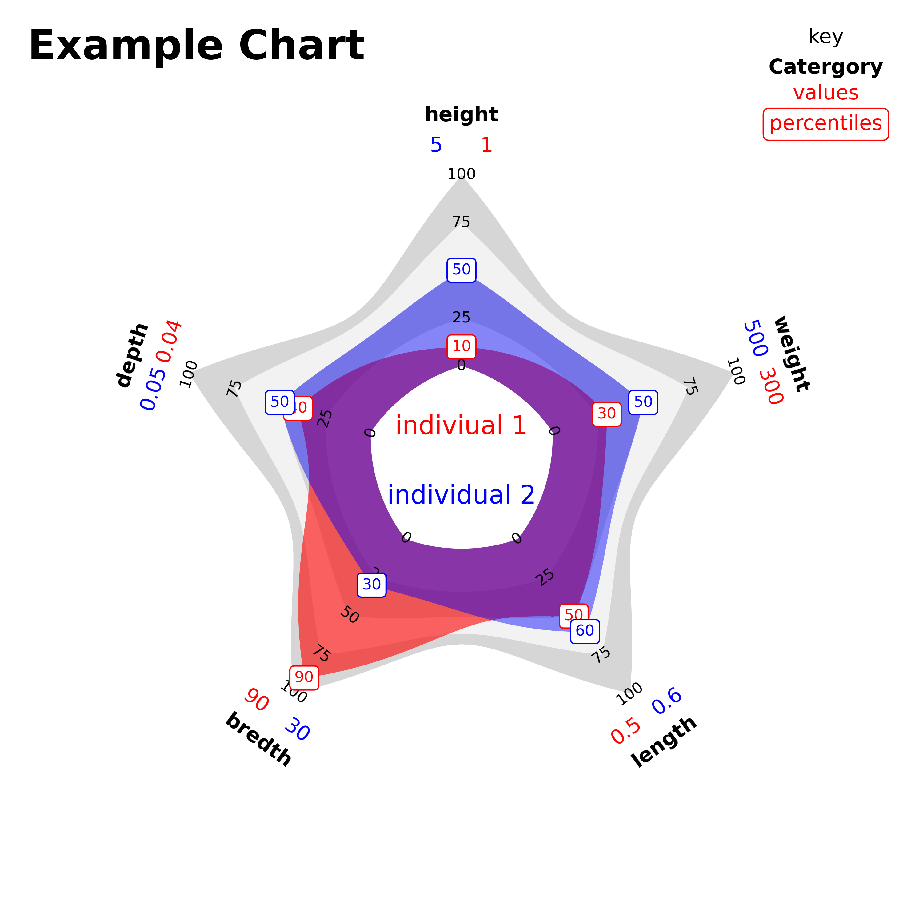
The enlarged central counter is not necessarily lost space though. It can be used for variable names or a title, especially when comparing two sets of data on the same variables as an overlay. Suppose you have data for several variables that you want to compare between two individual instanaces. Say the data can be normalised for each variable but you want to give values too. The (proportional area) radar is ideal for this. Here is an example of what can be done:
Alternative Formats
If you are not comfortable with the idea of each category ‘sharing’ its area with its neighbours and want each ‘spike’ to have its own area, then this can be achieved by interlacing the data with zeroes. The result is that the line enclosing each area returns to the central counter either side of each displayed value and we get a flower shape, albeit one with varying petal lengths. For this example of the flower style I have chosen a perfectly circular central counter.
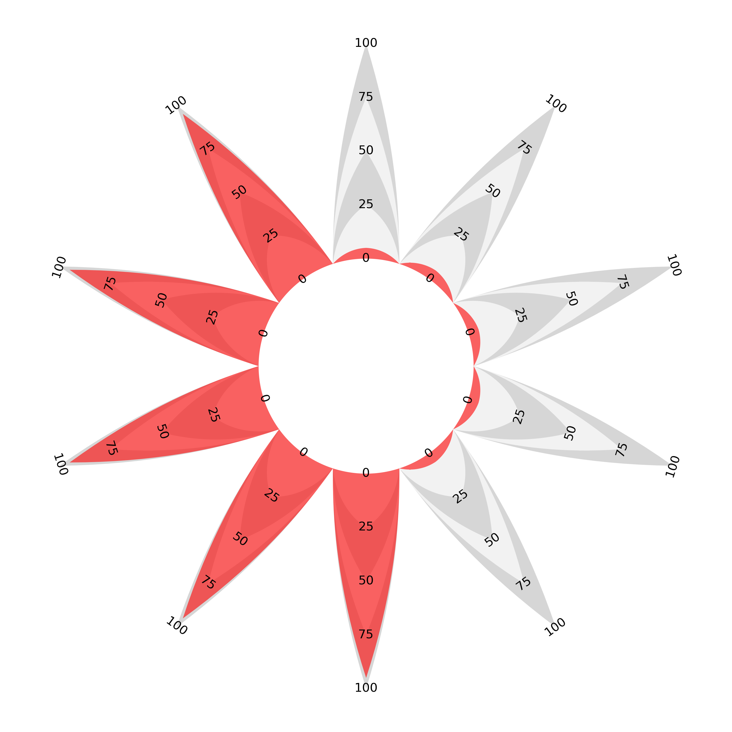
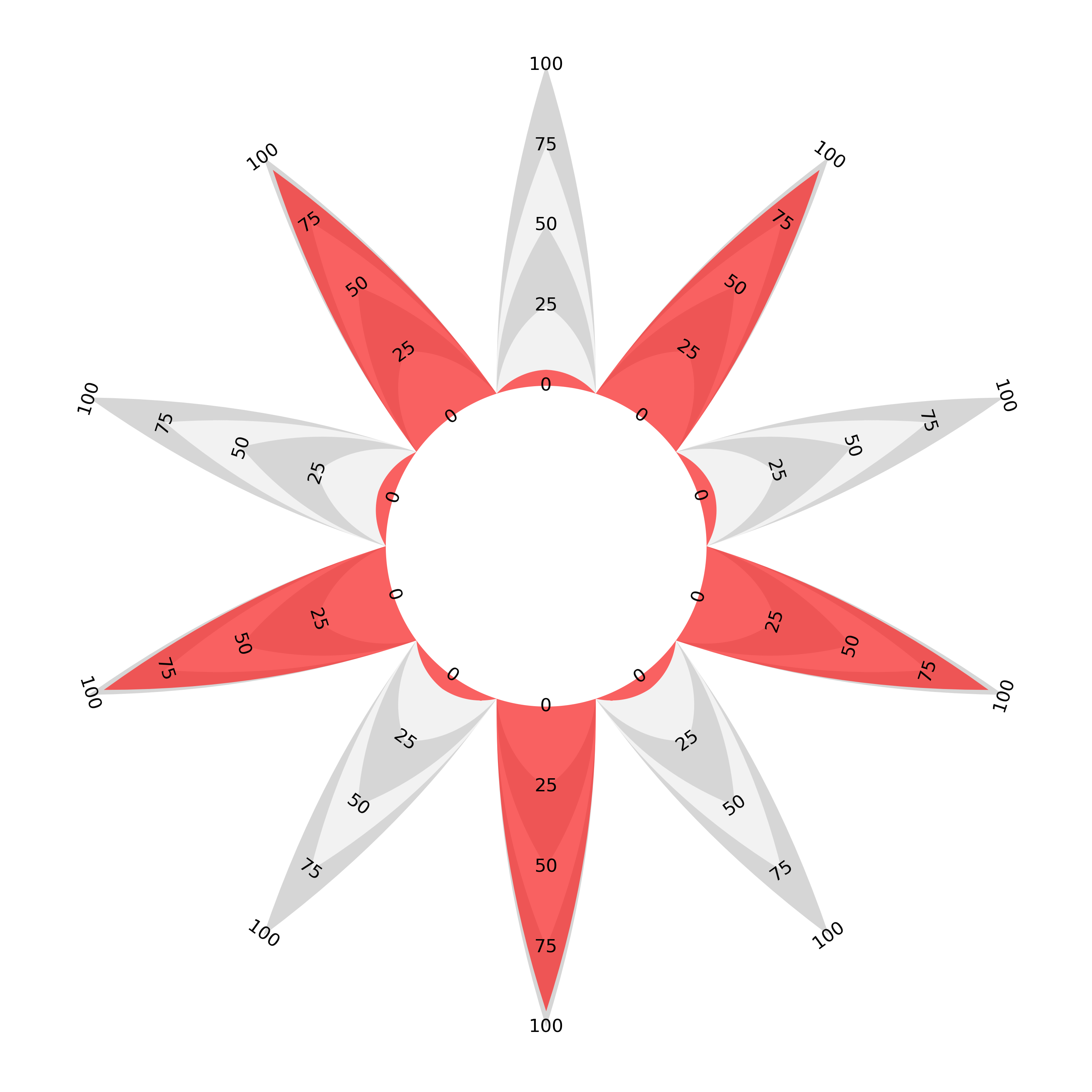
I mentioned at the beginning of the article that a radial bar chart would have to have bars of decreasing width to be area-proportional. If you make the choice that all bars should taper to a point the resulting ‘flower’ proportional area radar is the meeting of the two chart types under our proportionality requirement. A proportional area ‘join the dots’ with variable separation is essentially the same as a sectoral bar chart with pointy-tipped, area-proportional bars.
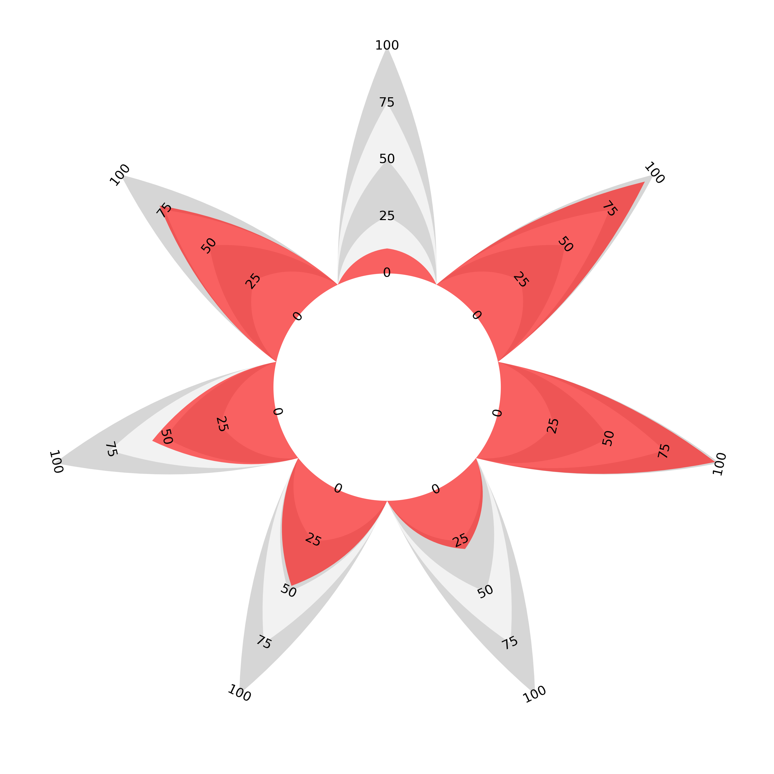
This isn’t to say that the flower style is a natural end point. Personally, I think that the introduction of so much white space detracts from the overall effectiveness of the chart, but the variable separation and the symmetry of each enclosed area (or equivalently pointy-tipped bar) does add some clarity. It’s just another possible format which also respects the area to length proportionality.
My hope is that people take this idea and play around with it. I’d be really interested in how people react to these charts and if the proportionality works intuitively for others too.
Python Package
A python file is available to reproduce the charts in this post
in the pa_radar repository on my GitHub — link: https://github.com/giacomowm/pa_radar.
Instructions on usage are contained therein.
A follow up post on the curve and code for the charts is here: (link to follow…)
Examples
Finally, here are a couple of examples of these charts in action: our team used these charts to show metrics for Inter Milan footballers in our group project in the (highly recommended for those interested in this kind of thing) Mathematical Modelling of Football course at Uppsala University [3]..